New captain. New ship.
Marden's Table and Takeaway
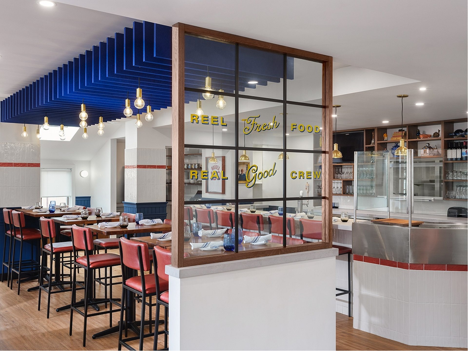
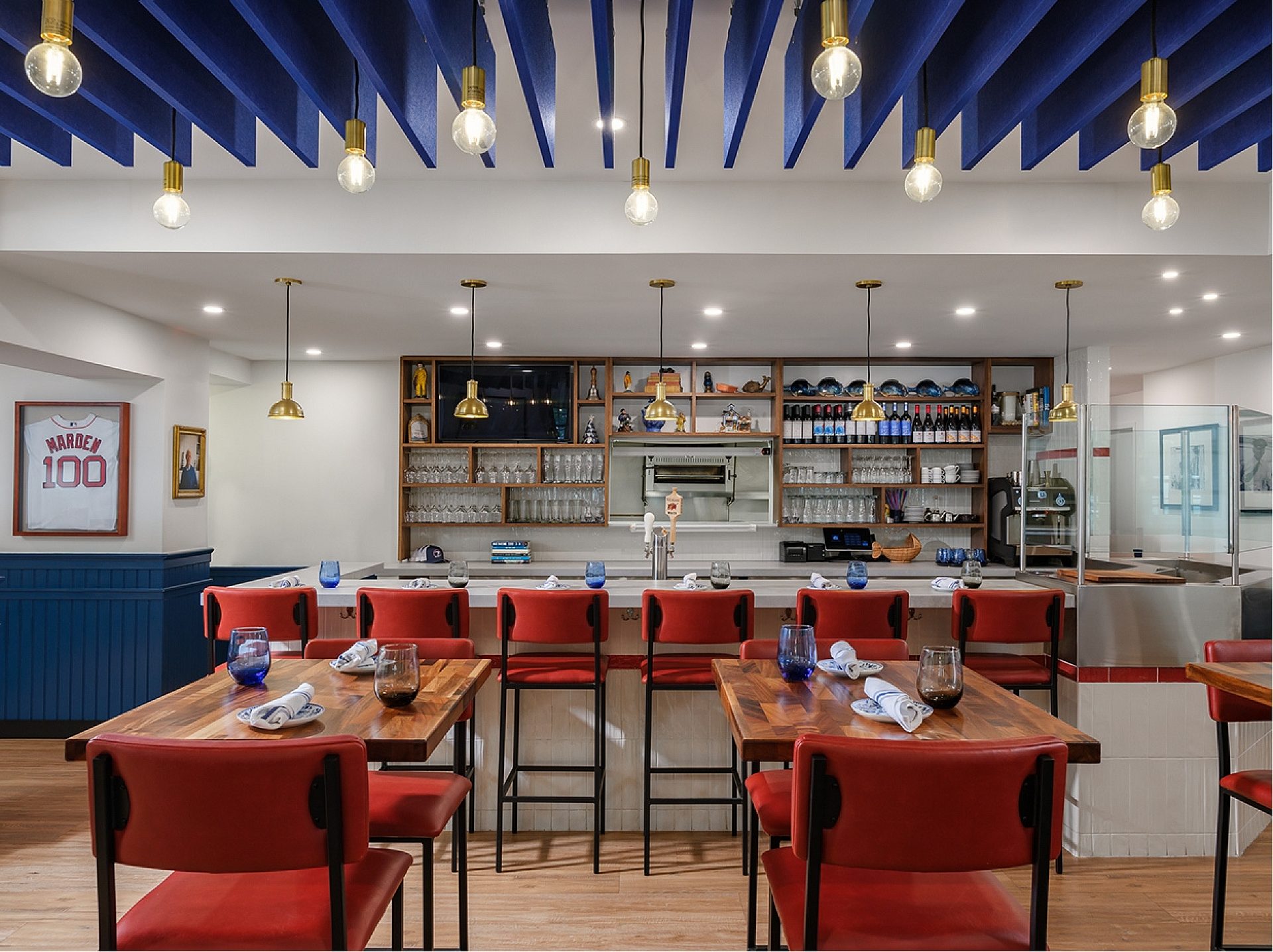
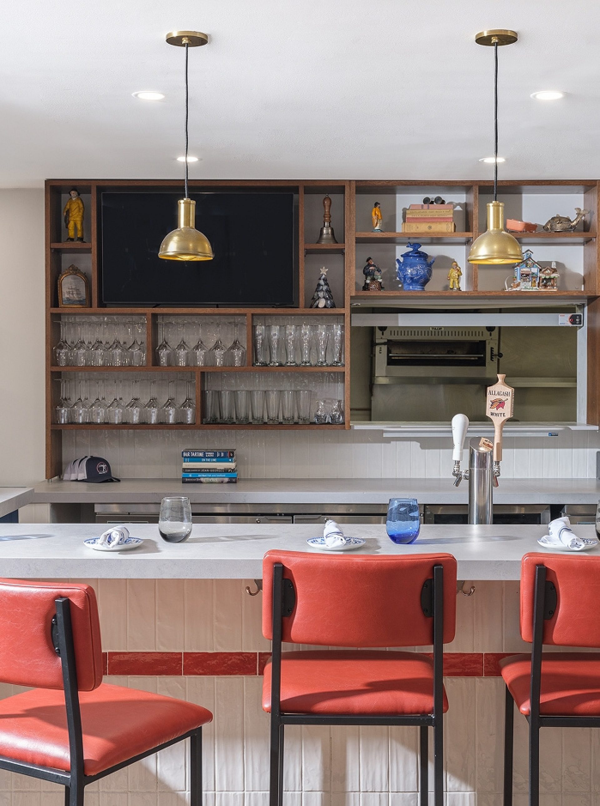
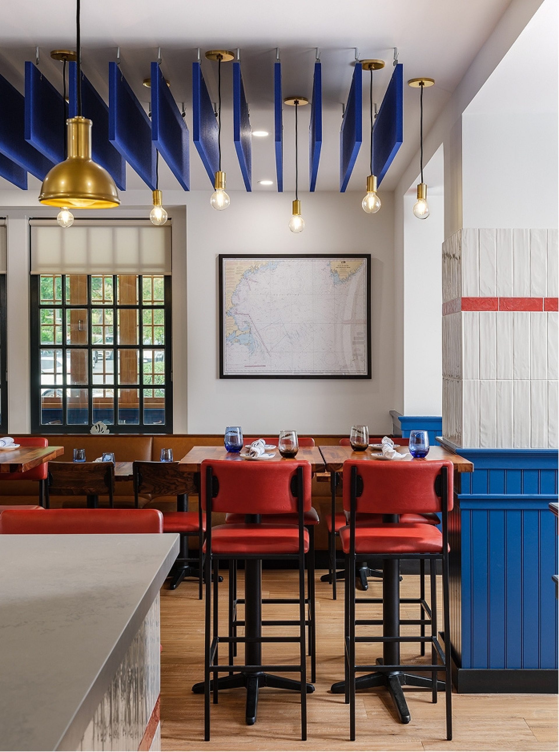
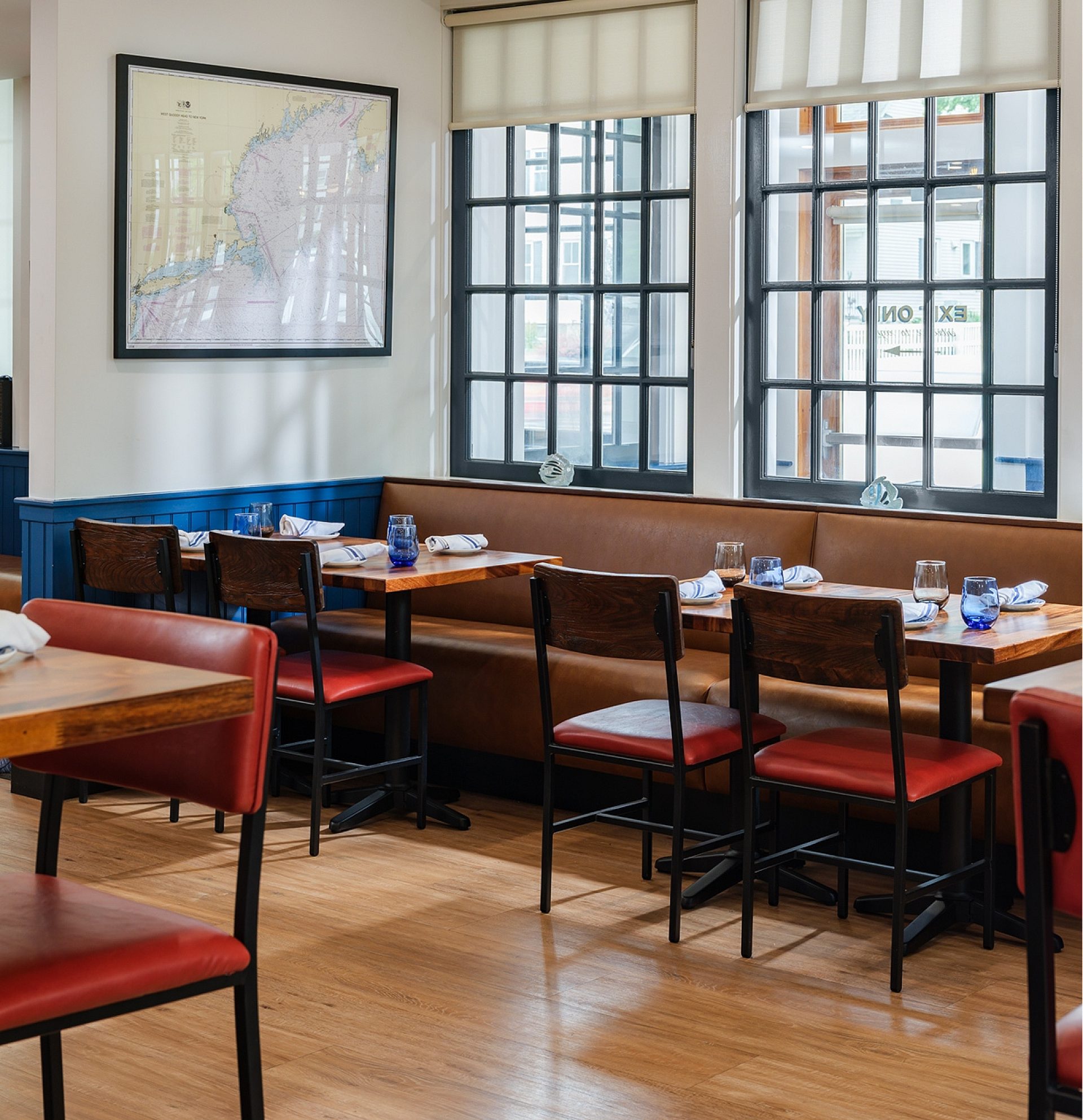
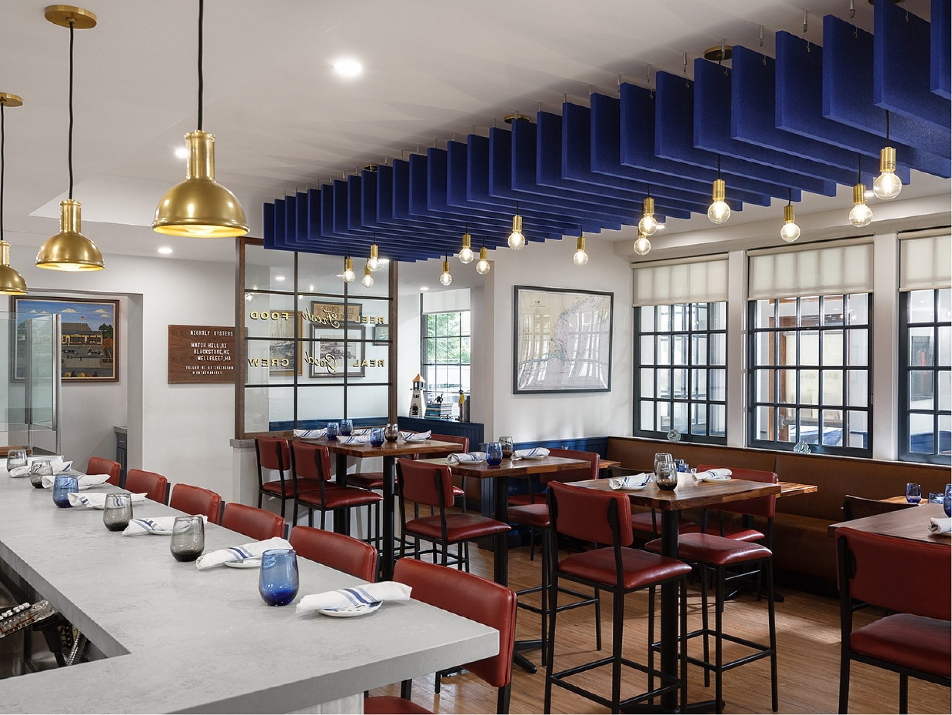
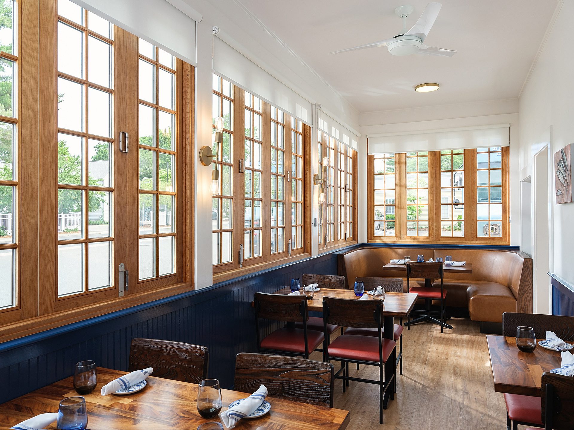
A new generation has taken the helm at area seafood staple, Captain Marden’s, and with that they were looking to revamp their Wellesley restaurant and its brand. We redesigned both in tandem, our favorite one-two punch, keeping what regulars loved while making room for who's walking in next.
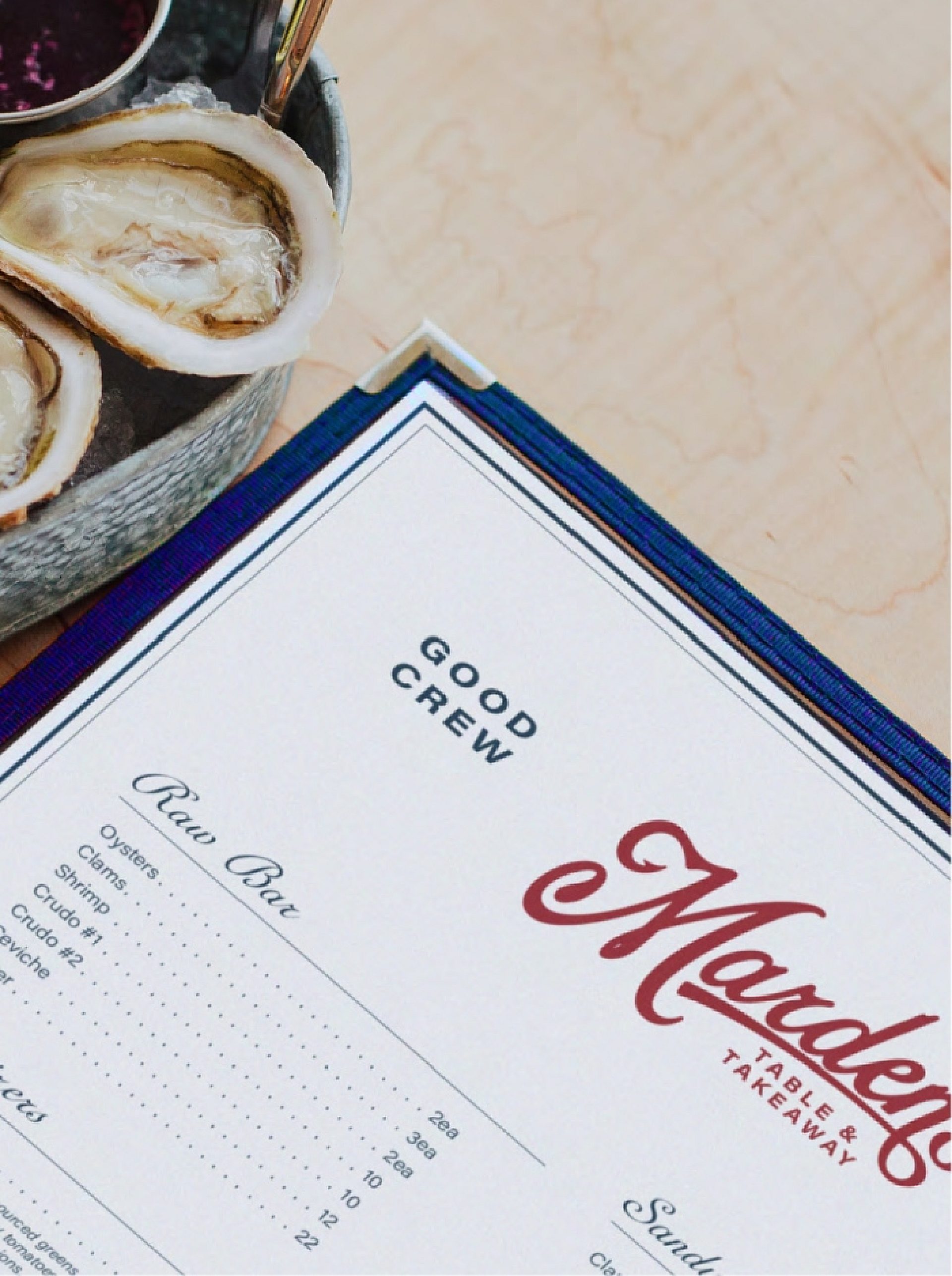
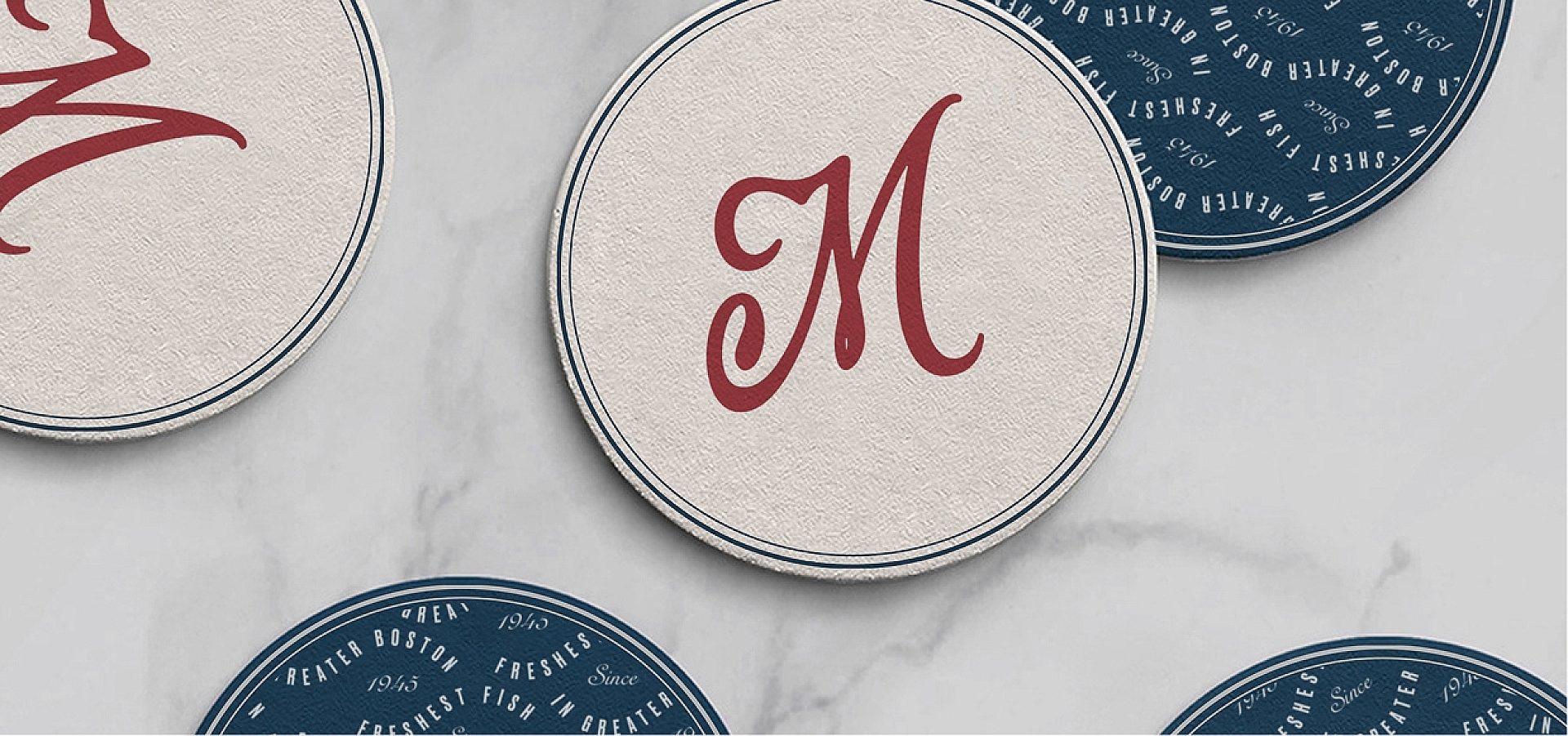
Before, the restaurant was more or less a dining spinoff of Captain Marden’s fish market and wholesale. Now, it's its own show with its own identity, starting with the name. It was previously the Captain’s Table & Takeaway. Functional, but a bit dated. Instead we leaned into the other side of the name: Marden’s. The Marden family has owned and run the beloved company for three generations. What better way to reimagine the restaurant than doubling down on their decades of quality and service.
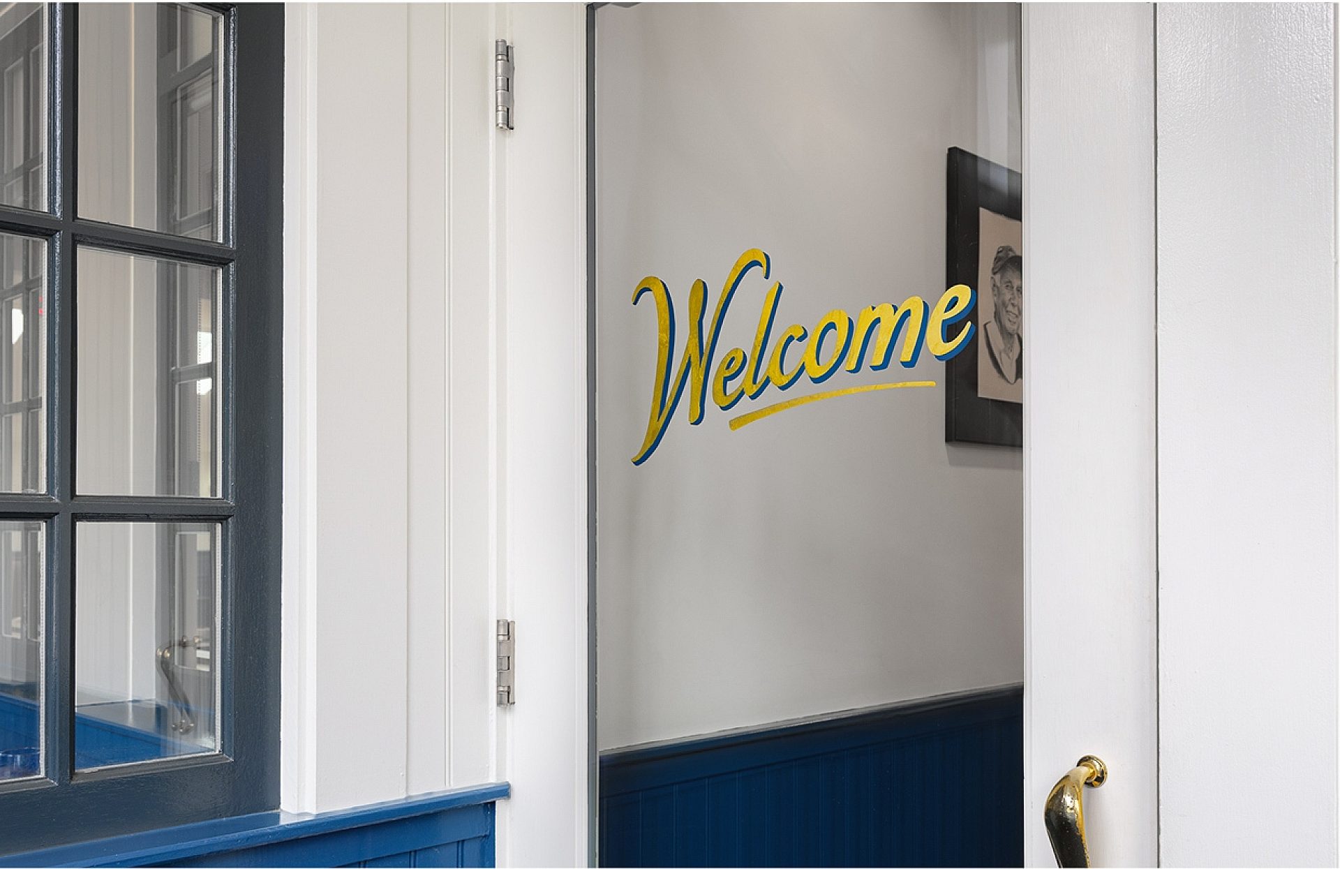
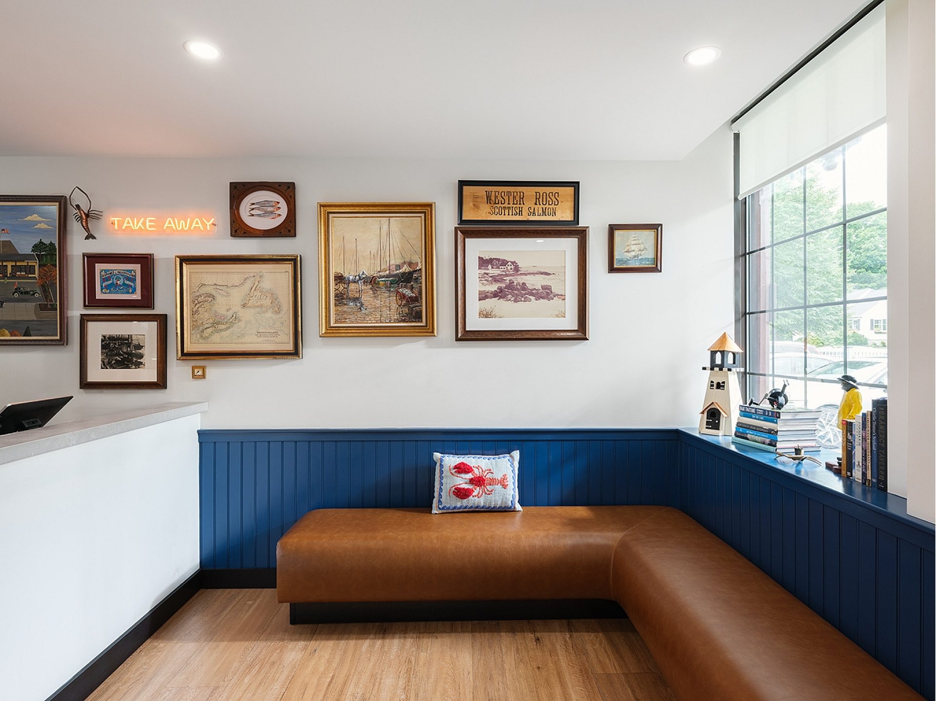
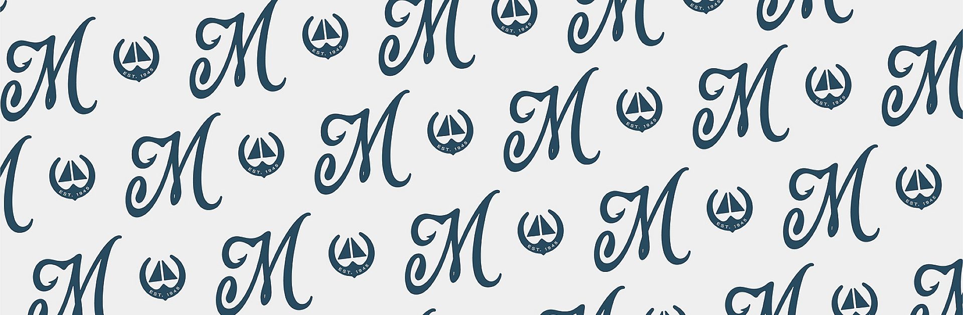
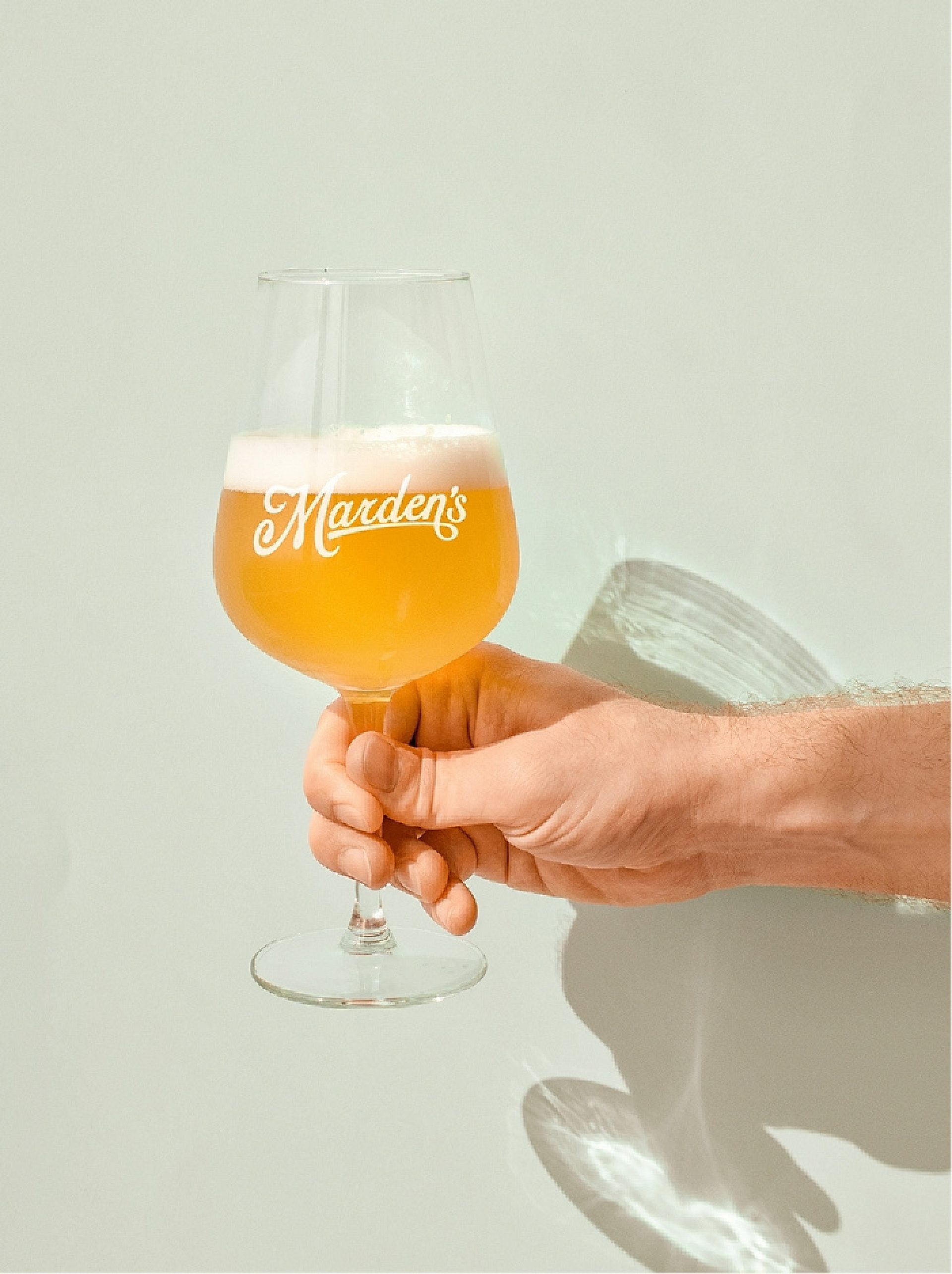
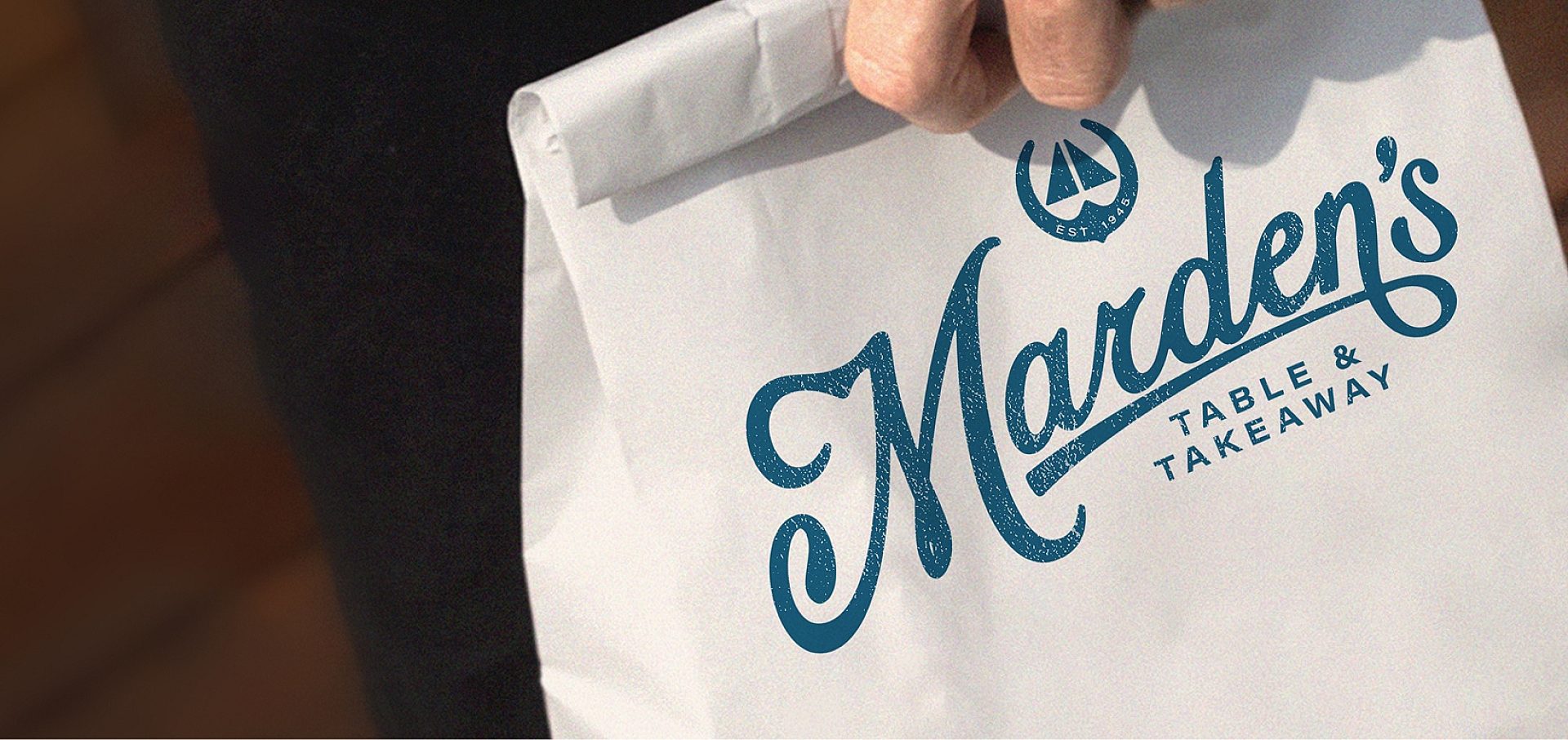
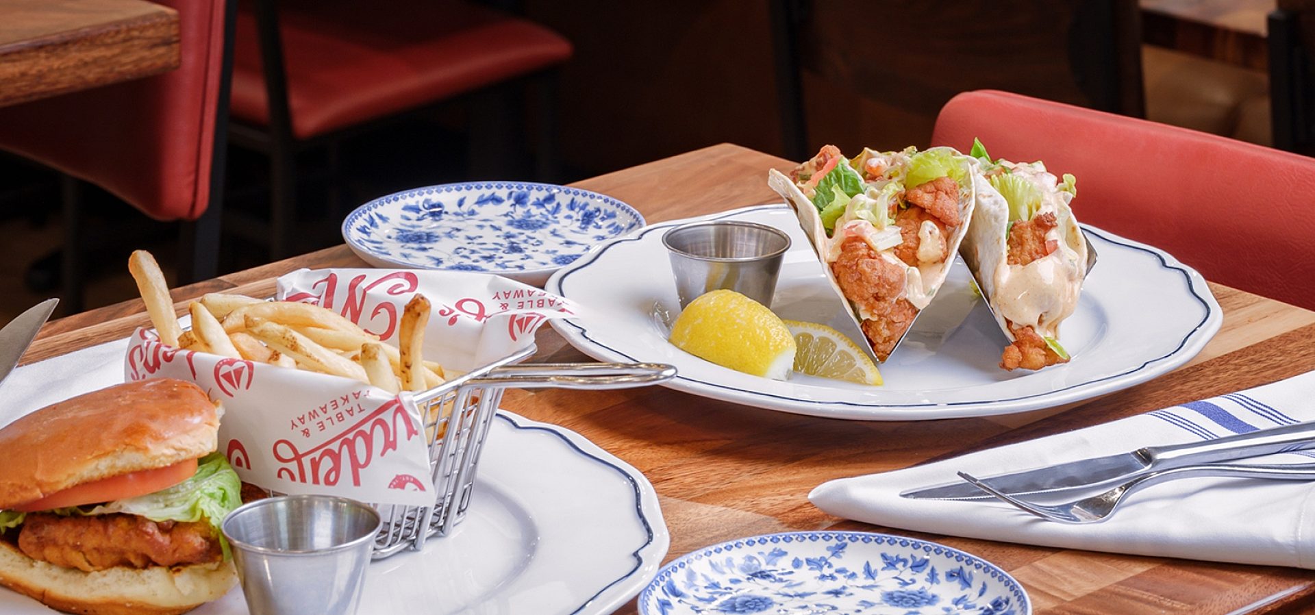
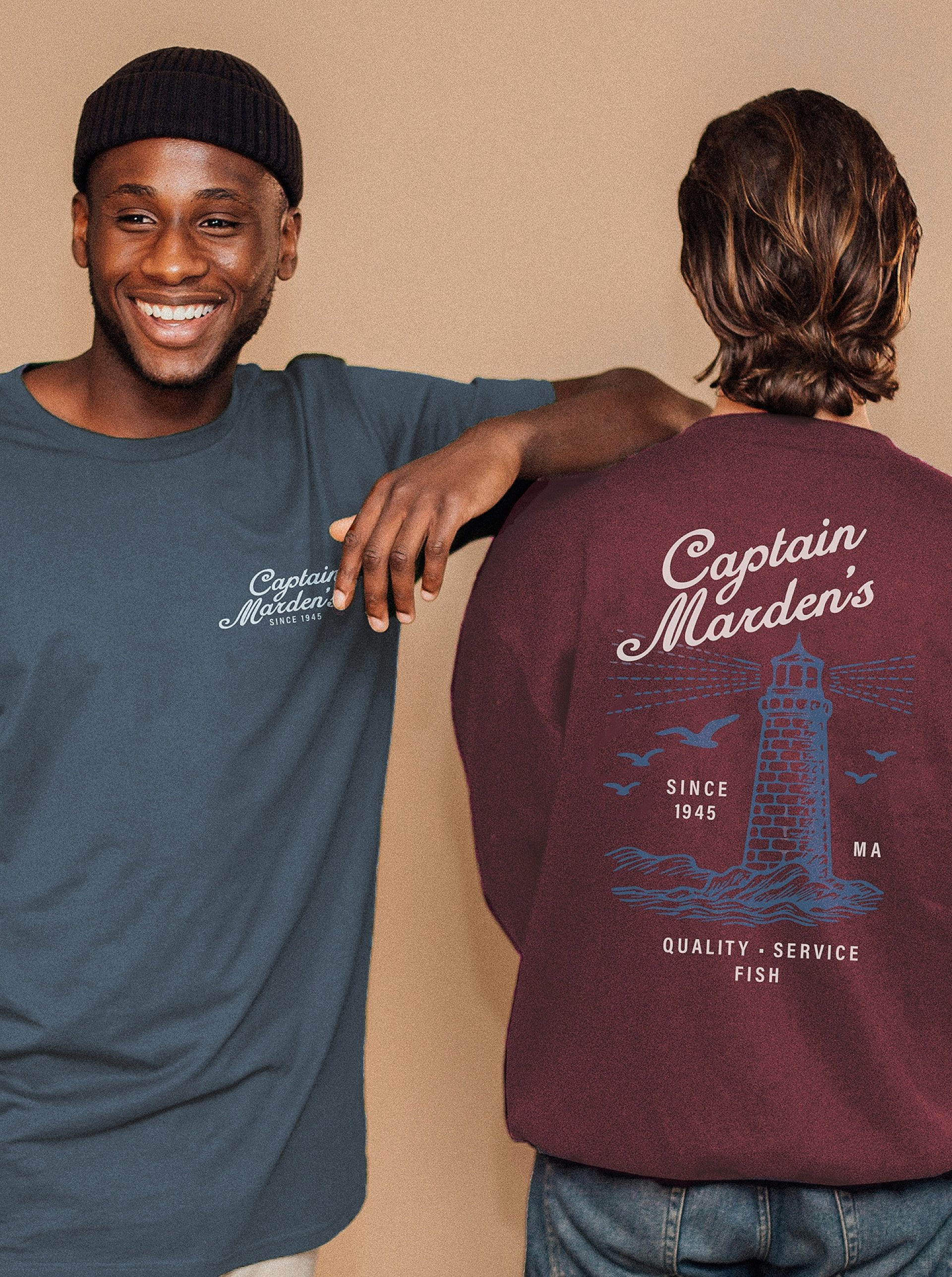
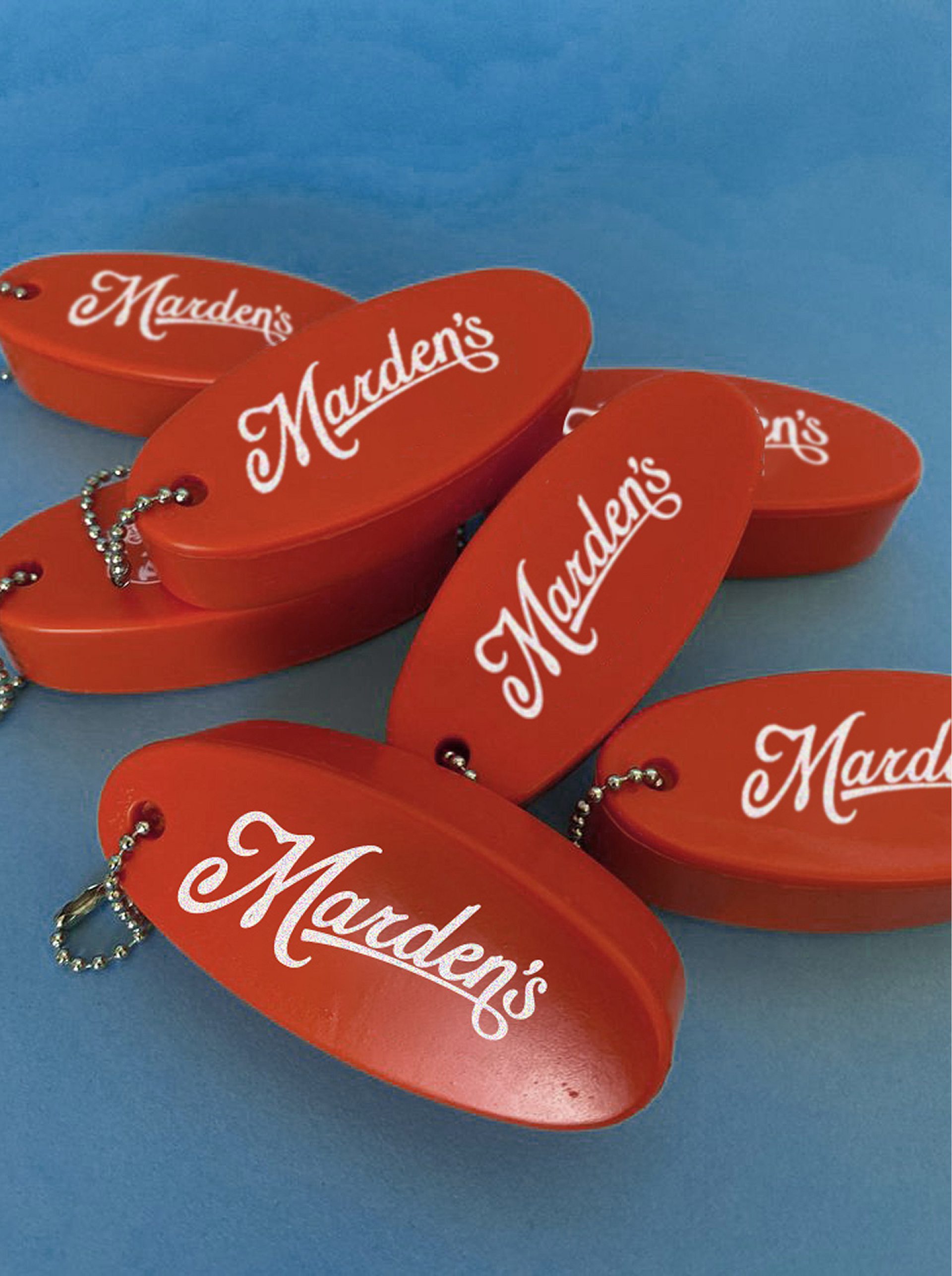
We did a deep dive into research and collaboration with the Marden family to get to the heart of what the new restaurant and brand should feel like. We landed on classic, fresh and modern. Brand took the slight lead starting with pages of sketches and handmade logo options, just like classic brands. We landed on a strong but approachable signature script with a subtle hook embellishment, and paired it with a modern spin on their color palette. The space, program, and menu took shape from there, paying close attention to the previous space and building (once Wellesley’s train station). Everything is fresh, clean, comfortable, bright and layered with heritage. Hand-painted signage sees that thread through, adding even more characters and personality to the space. The Mardens couldn’t be happier as they continue to welcome their longtime customers and the new generation hungry for the “best from the boat.”
Wellesley, MA
Services
Architecture
Interiors
Brand Design
Signage
Apparel
Font Design
Logo & Identity
Menu Design
Naming
Packaging
Renovation
Collaborators
Rick Aston
Adam Danielson
Providence Painted Signs
New England Seating
Brian Doherty