American bistro.
Brazilian style.
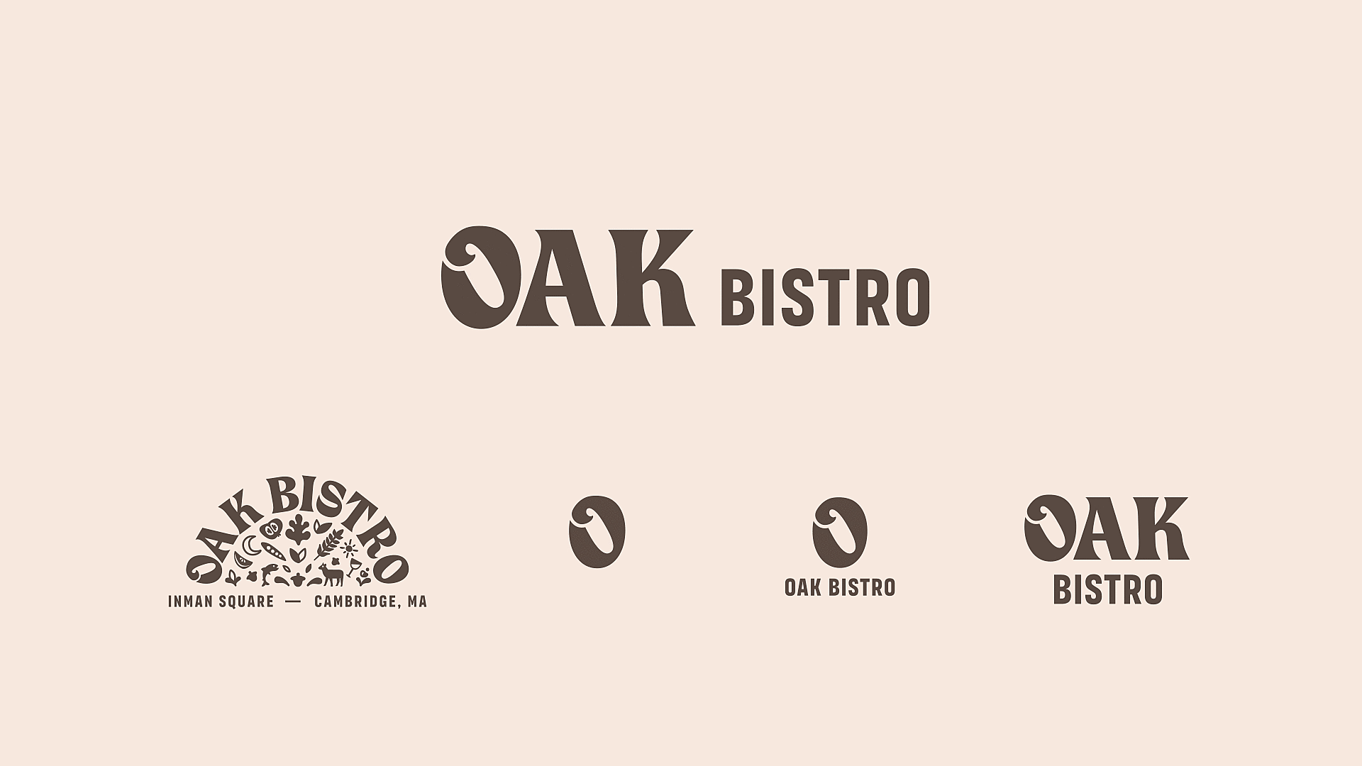
Oak Bistro
Two cousins were making their dream come true — opening their own restaurant after years in the industry. The name honors their Brazilian grandmother, Paula de Carvalho, the farm they grew up on, and learning to cook alongside her and their grandfather. They came to us to bring that story to life.
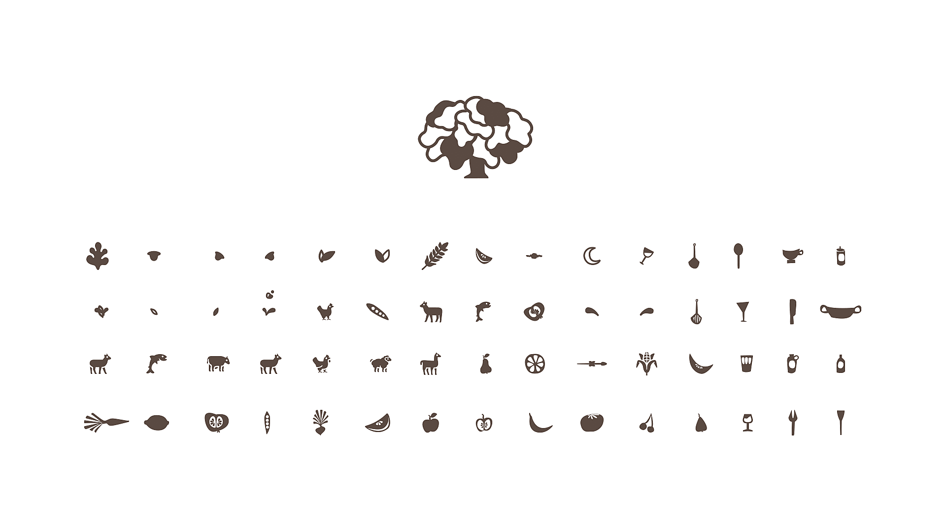
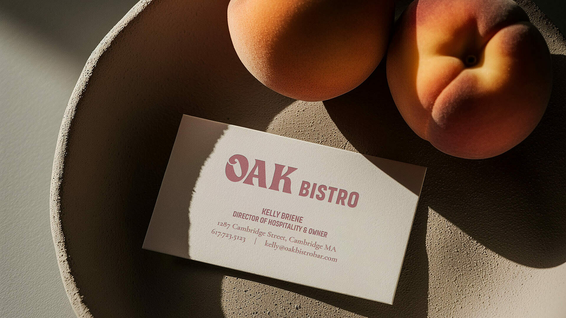
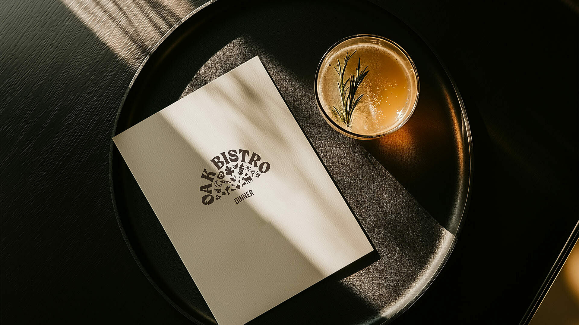
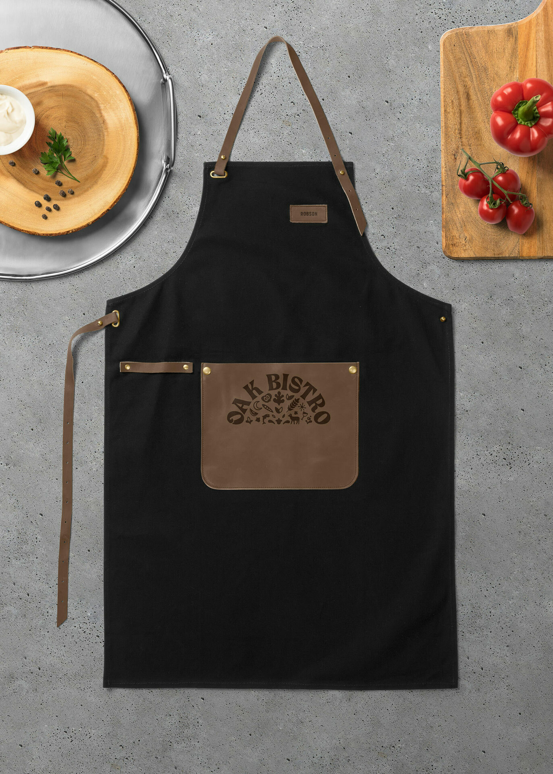
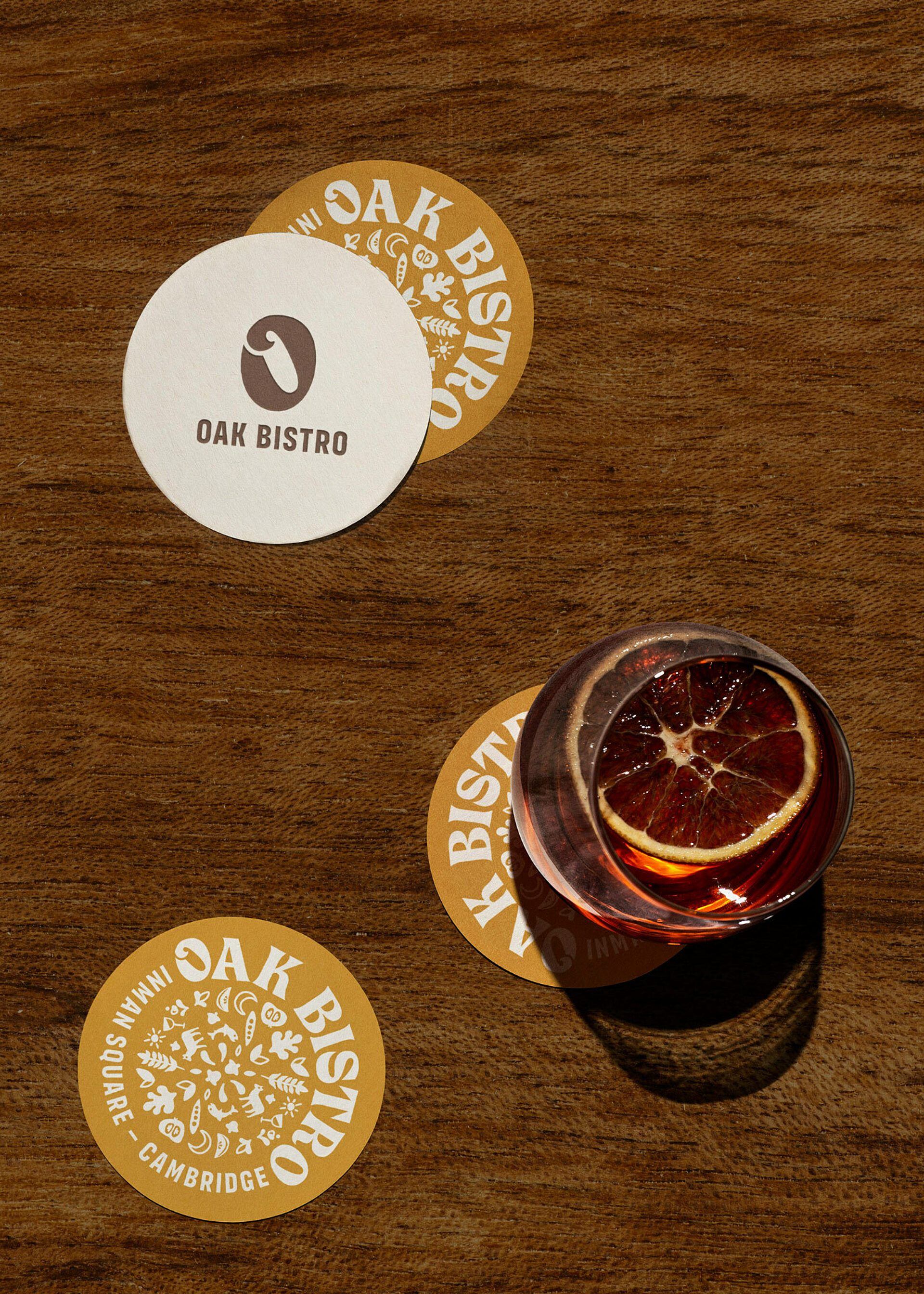
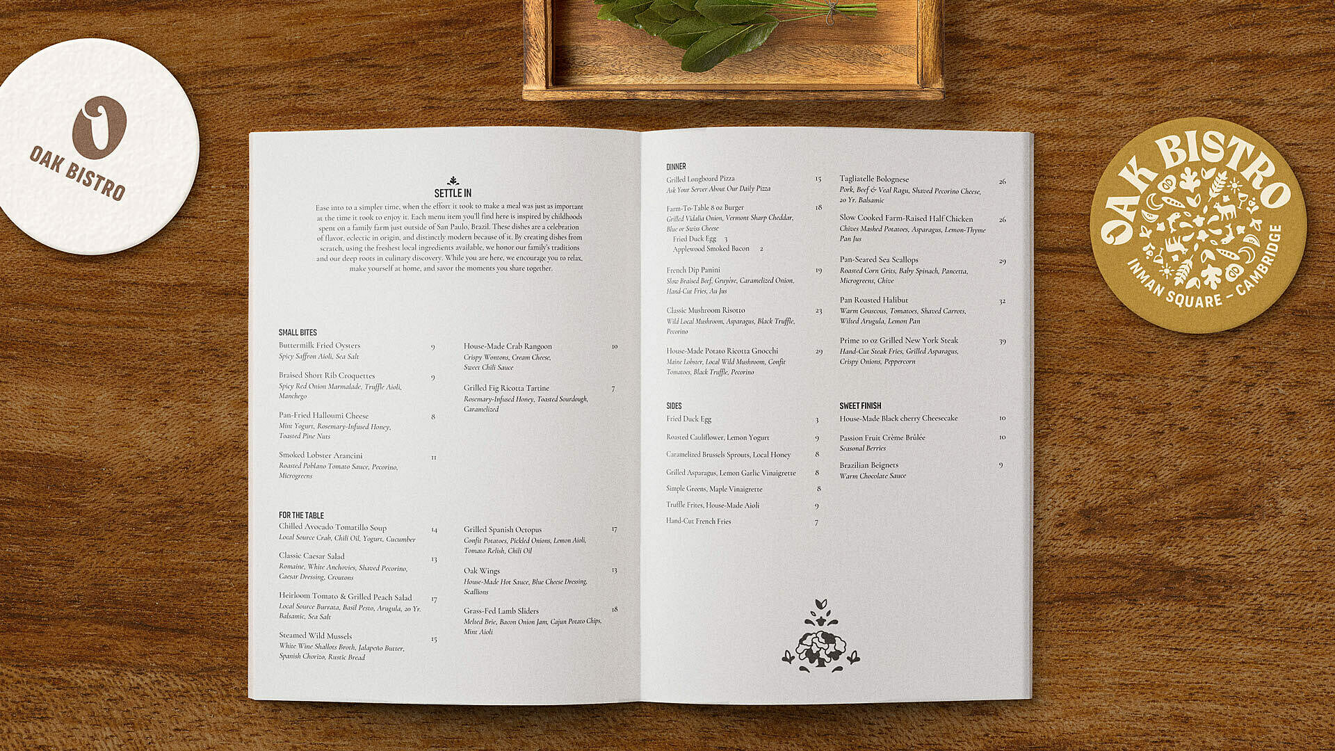
Our clients are an absolute joy to work with, and the passion they bring to everything they do is unmatched. So, we worked equally hard to make sure their brand was as authentic to them as possible. To develop it, we dove into their history, their story, and the region they grew up. We researched type foundries in South America to stay true to their origins and really create a felt sense of place. We landed on a wordmark that is reminiscent of hand-carved wood and gave the ‘O’ a more distinctive detail. This attention to detail layers on a touch of their personality while also creating functional flexibility in the identity system to create a shorthand version of the logo. The dishes are made from scratch —many family recipes—with fresh ingredients, so we created custom illustrations and various arrangements. They help add another layer of meaning to the identity and give our clients a more extensive toolkit to use as they continue to express the brand. Every detail down to the book-style menu invites guests to slow down, truly connect, and just enjoy being present with one another. Just as our clients learned from their generations of family, that’s what matters most. Saúde.
Cambridge, MA
2,500 SF
Services
Logo & Identity
Signage
Menu Design
Apparel
Creative Direction
Illustration
Renovation
Brand Design
Collaborators
Fast Signs Waltham