India.
To-go.
Bati
When Shanti, a beloved Indian restaurant of 25 years in Dorchester, saw an opportunity to bring their delicious dishes to even more people, they came to us to help bring it to life. They wanted to create a new, fast-casual Indian concept with prime space inside North Station’s bustling Hub Hall,...
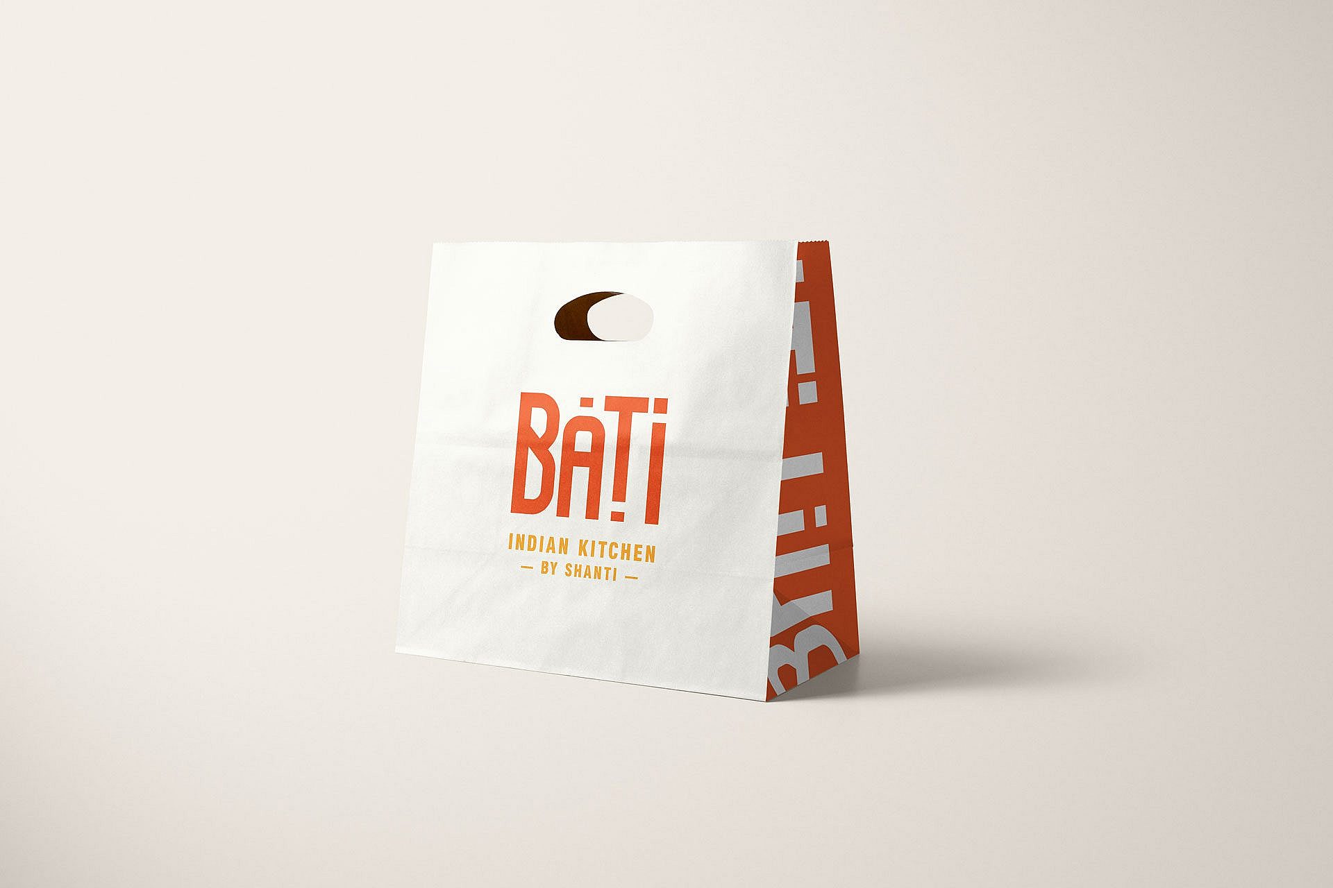
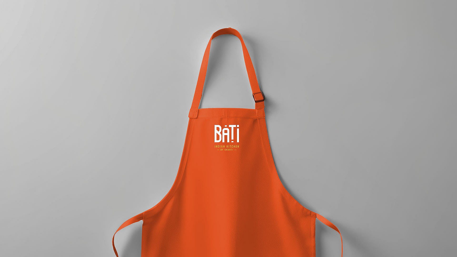
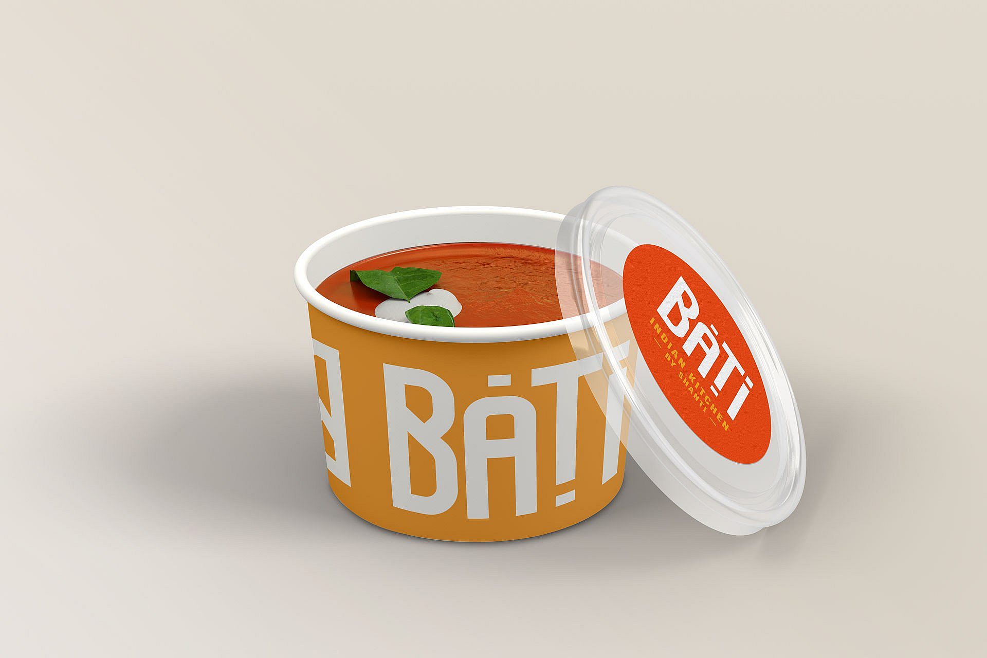
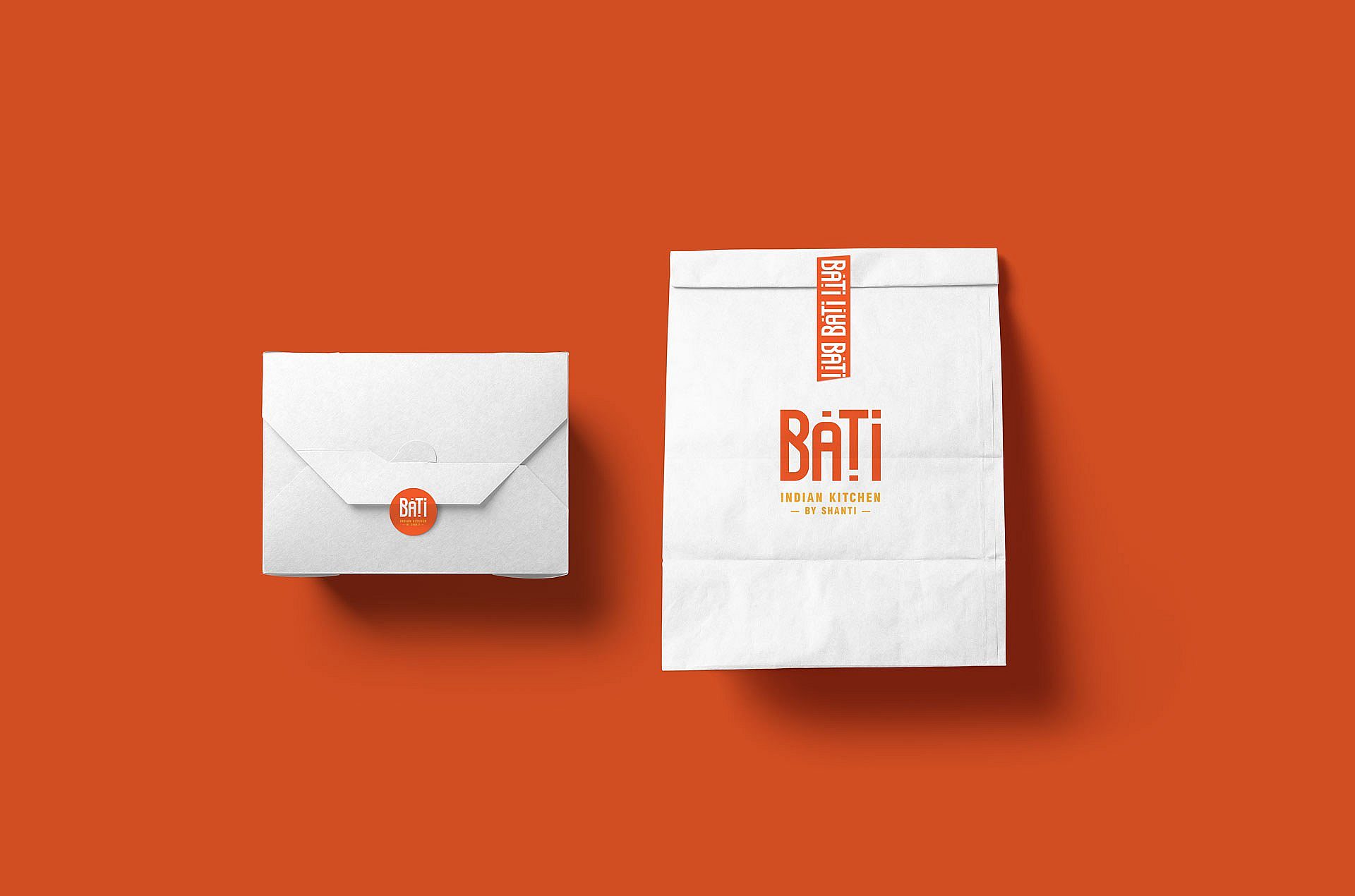
Shanti has a well-established customer base, but it’s more of a sit-down experience. Our clients wanted to differentiate the new to-go concept, let it stand on its own, and have room to grow while subtly tying back to Shanti. We dove into naming exploration first, experimenting with a wide range of names and directions. Overall, we wanted to keep it authentic and meaningful to the concept but also easy to say and remember. We landed on Bati, which is Bengali for “bowl,” relating directly to the fare they serve. It also shares the same “-ti” ending as Shanti, a nice tie for the sister brands and recall. From there, we dove into brand identity design, creating a wordmark with modern Eastern-style letter forms, keeping the accent marks as a visual signifier of authentic origin. For colors, we chose a turmeric yellow and a deep orange-red to represent the spices used. We made a pattern by flipping and repeating the logo along a line as a final touch. Used as a custom tape, this adds a quick branded element and ensures food won’t spill on the way home. In the end, it was a succinct brand design project but a thoughtful and meaningful one that will help our clients introduce more people to their delicious food and help them continue to scale.
Boston, MA
200 SF
Services
Brand Design
Creative Direction
Naming
Packaging
Signage
Copywriting