Real estate. Redefined.
District
Our friends at District have been making quite a name for themselves in commercial real estate. To help them capitalize and stay out in front of that success, they wanted to do a complete brand redesign. We were all about it and are proud to have handled every aspect of it.
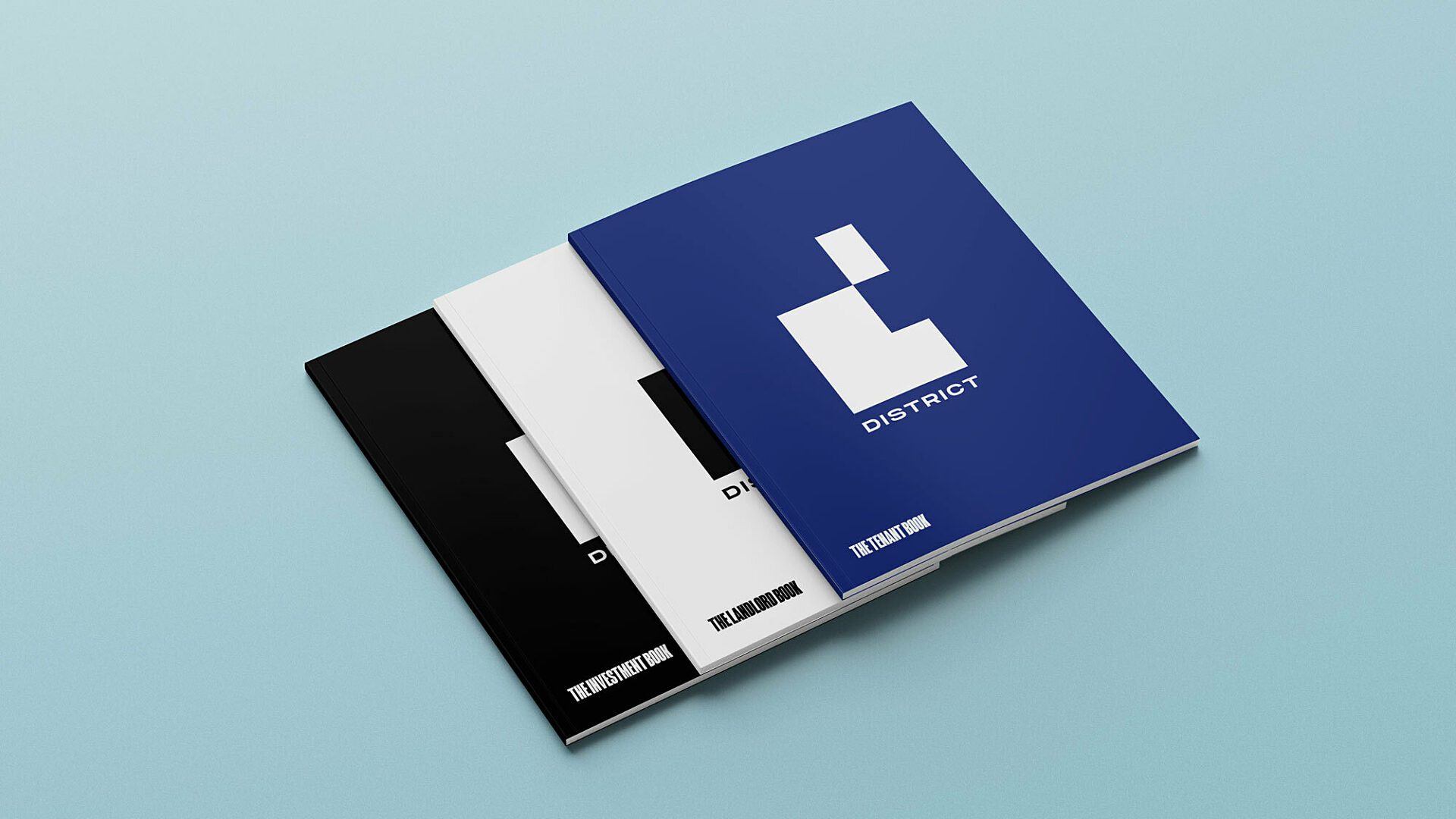
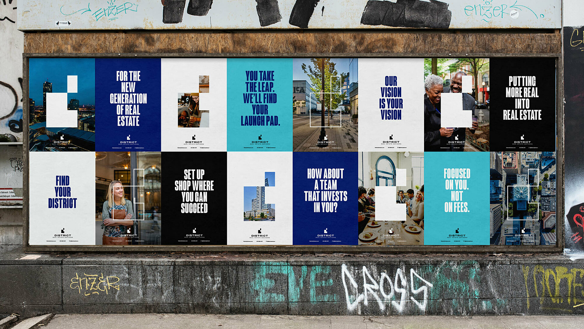
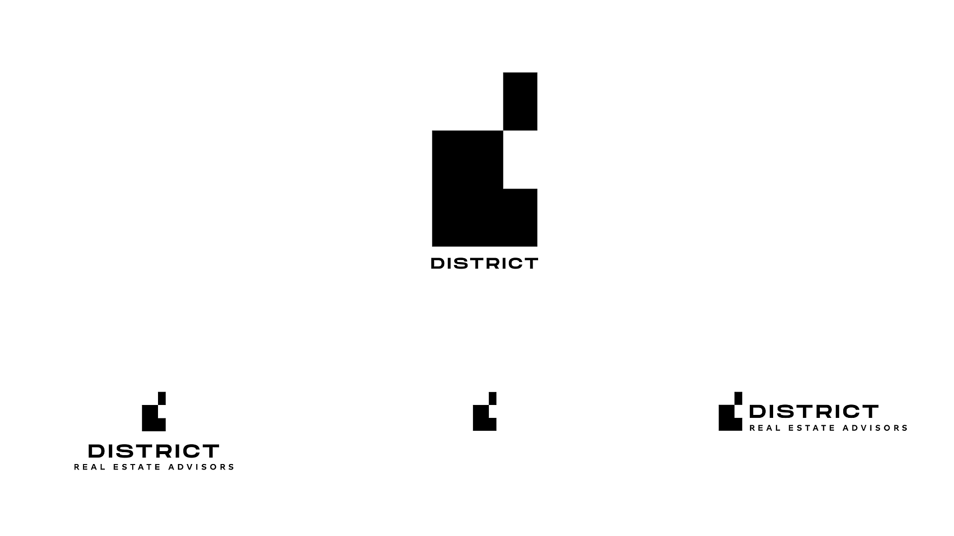
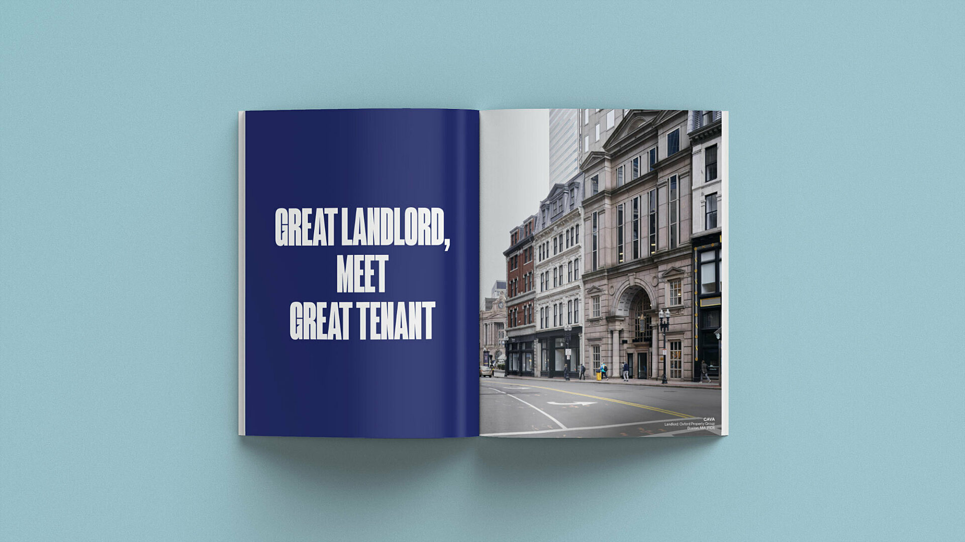
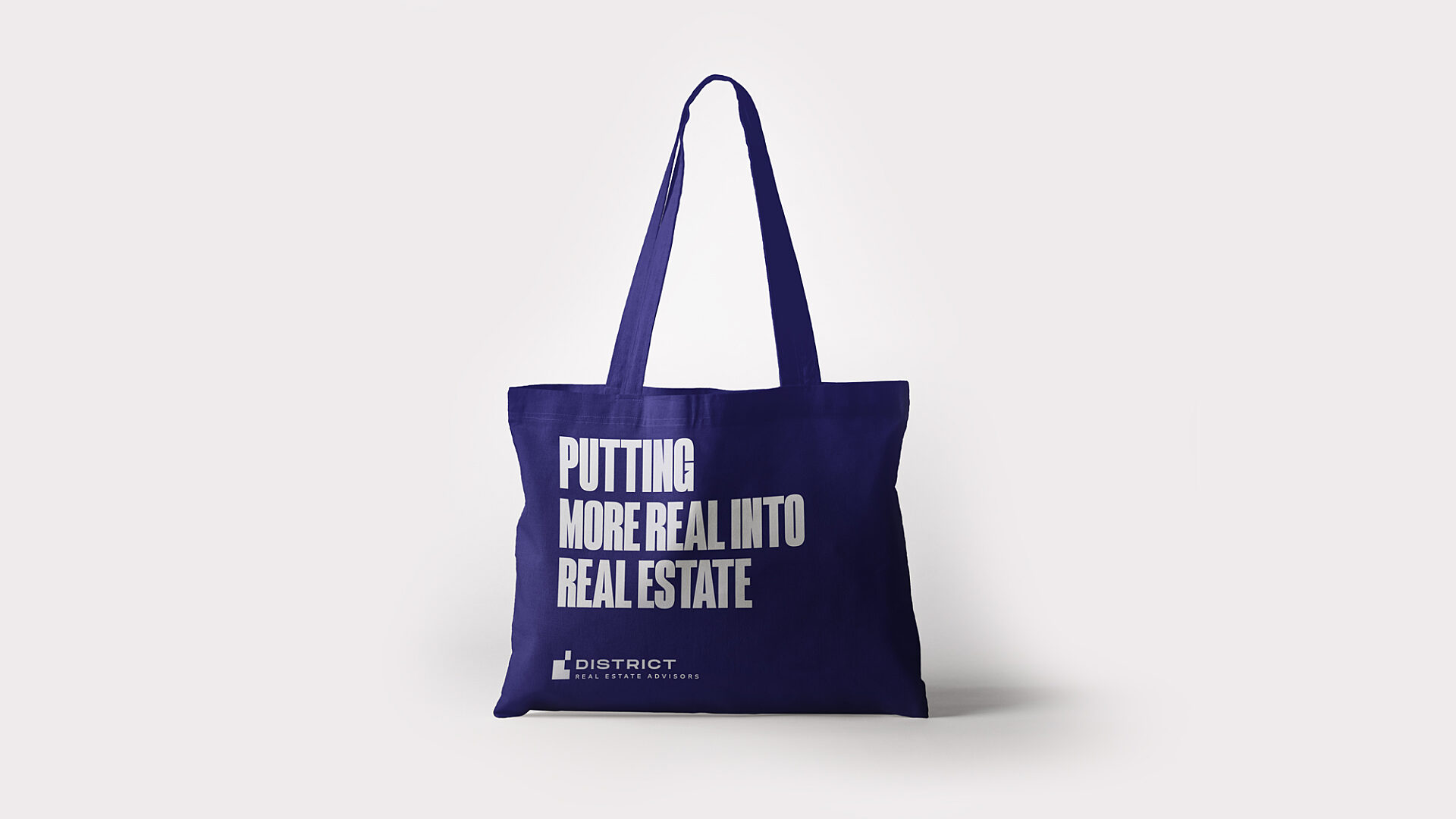
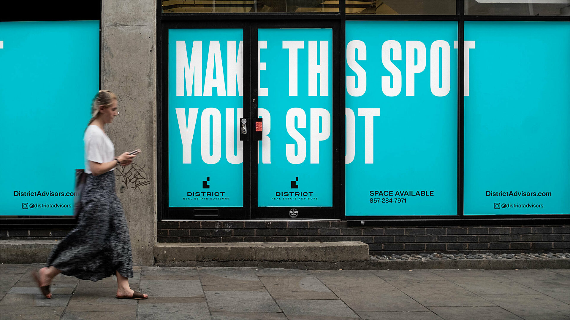
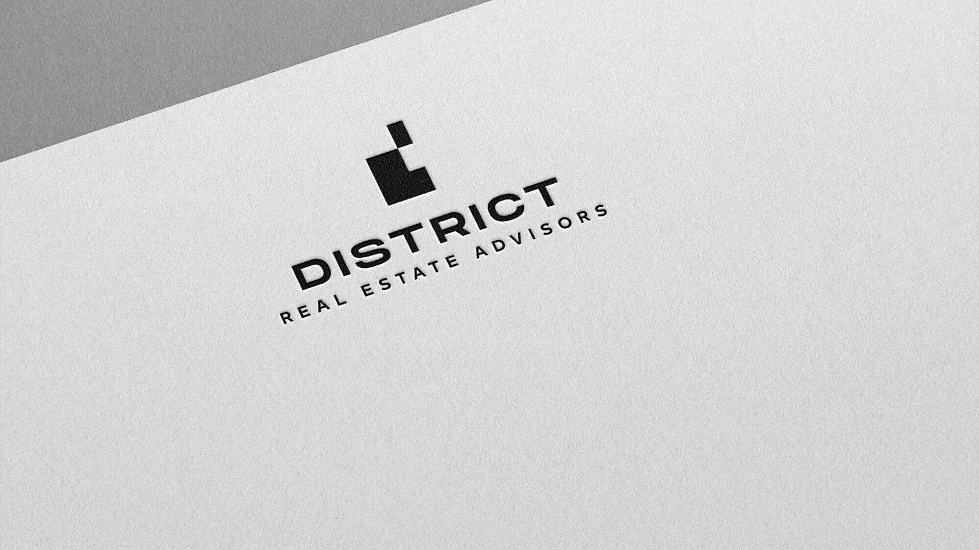
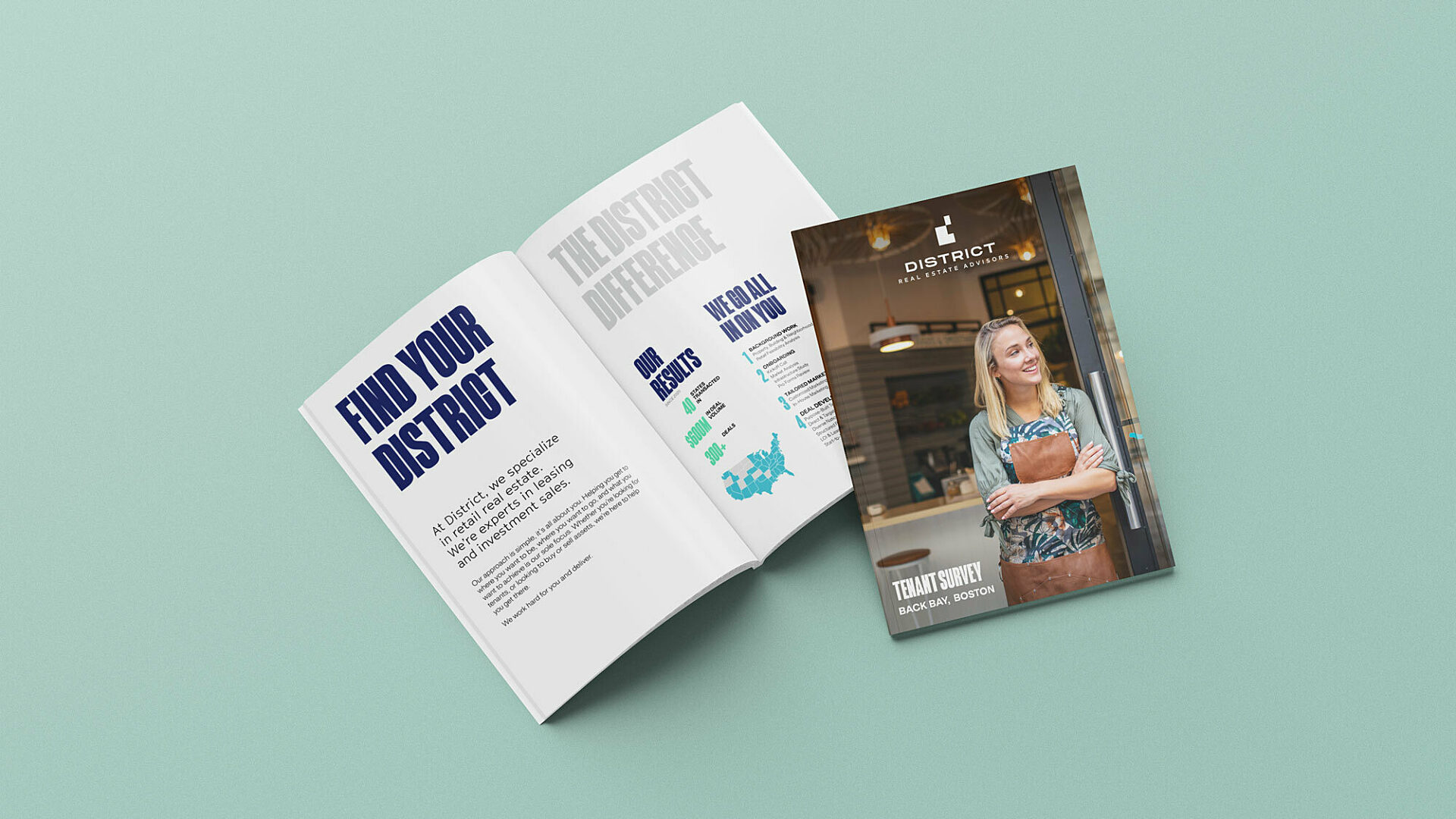
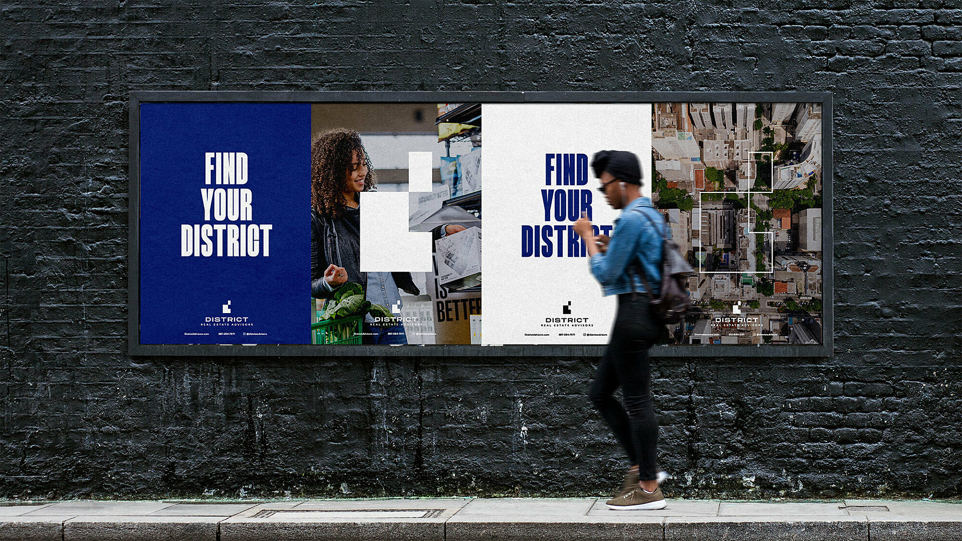
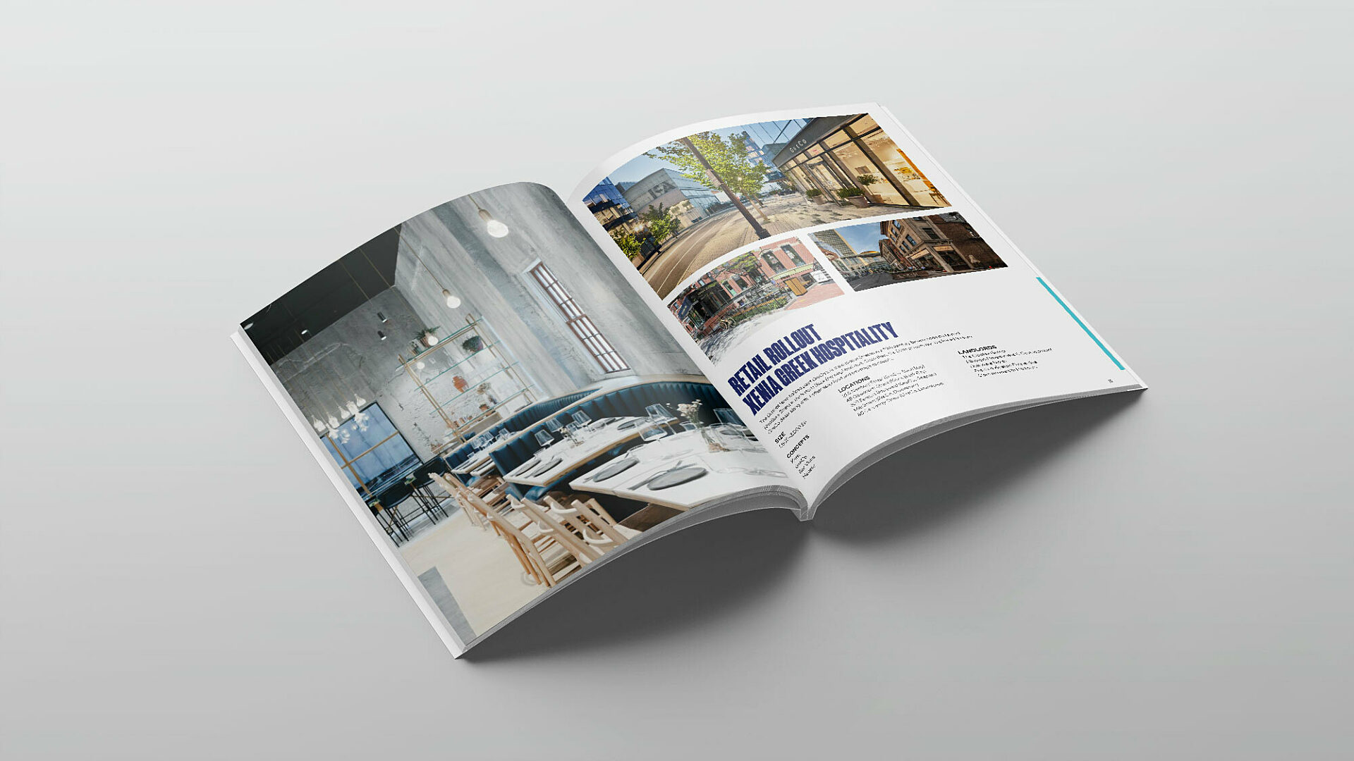
District caters to several different client groups — tenants, landlords, investors, and developers — so it was important to create a rebrand that could connect with all of them. After a deep dive into strategic exploration, we landed on a visual identity that leverages District's name and ties it to a sense of place, and most importantly, purpose. The icon is a modern take on a lowercase d, and an abstracted aerial view of a city block. The ascender of the d can then be perceived as either fitting into the block to find your perfect space, or elevating above, stepping outside of the crowd, to find your own unique space. It’s strong, iconic, and thoughtful, while also open to discovery and interpretation. From there, we rounded out the identity with bold and impactful type, a professional yet active color palette, and a brand voice that is hardworking, confident, personable, and engaging. We’re proudly still along for the rebranding ride, working hand-in-hand with our District friends to express the new brand wherever we can and build off this new foundation. Look for it around the city, region, and the country.
Boston, MA
Services
Brand Strategy
Brand Design
Logo & Identity
Collateral
Stationery
Website Design
Copywriting
Advertising
Collaborators
District
EM Letterpress
Jackie Nelson
Basch Solutions
Ben Gebo